A perennial challenge in Ursa Studio, as with any other analytics software, is for users to understand what the data they’re looking at means, where it comes from, and to make sure that it represents the same interpretation of clinical concepts that they have in mind. This how-to guide aims to provide an overview of the ways that Ursa Studio end-users can approach that question.
There are two general categories of inquiry. The first is agnostic of the local data situation of the customer implementation, for example: what is Ursa Health's CKD staging logic? The second category are questions that are local to the customer environment, such as: what is this record doing here, or which of my data sources is supplying this information? Often, an end user’s question will involve both categories of inquiry. However, the strategies for each category is often different, as we’ll show.
Level 1: Simple Self-Service
For local-data-agnostic questions, users should first look for terms, as well as the documentation on the knowledge base.
Terms for each field on a measure can be seen by hovering over the question mark next to the field name. Field names with no adjacent question mark have no terms defined. Users can see all the terms on the measure, including terms that are not tied to a particular field, by clicking the book icon near the top of the screen. The example at the bottom of this how-to guide will demonstrate the process of looking up a measure’s terms.
For a more in-depth analysis of key concepts that undergird the data transformations, users should go to the Key Concepts section on the knowledge base for the module that they’re consuming. For example, a detailed narrative of our CKD staging logic can be found in our “Ursa Health Chronic Kidney Disease” module documentation: https://docs.ursahealth.com/v1/docs/ckd-key-concepts-ckd-stage
For questions that deal with details of the local data environment, the best first step is to pull up the measure in Case Review and look at the row-level detail. For example, if you’re trying to understand what source each row comes from, you could look for a “Source ID” field in Case Review. You can use the “Choose Fields” iconbutton near the top of the screen in Case Review for a searchable list of available fields. To continue the example, if there is no “Source ID” field, then it’s likely that each record represents a merged analysis involving multiple sources, and a more thorough deep-dive may be needed to tease apart the impact of each source.
Each measure in Ursa Health's analytics modules come with a wealth of data fields, and familiarizing yourself with the available fields for the measures that you are interested in is an invaluable first step to understanding the work behind the analysis.
Level 2: Ask your CSM!
Often, a user’s question will require a deeper dive than can be accomplished just using the tools available in Case Review. In such circumstances, it is always appropriate to ask your Ursa Health CSM for help. Our CSMs are here to make sure that you’re getting value out of these reports!
Typically, the best way to package up a local-data-relevant question for a CSM is via the “Share this Analysis” iconbutton in Analytics Portal, which will post your question to the News Feed and send a (PHI-free!) email to the users of your choice. Add filters to isolate the rows that you have questions or concerns about, pin the key columns to the left-hand side of the board, and press the share iconbutton. Doing so will help minimize the chance that the essence of your request won’t get lost in a game of telephone, especially if the CSM has to pass on the request to, say, a data integration engineer.
Level 3: Trace Back to Object Workshop
Users with the appropriate credentials and enough gumption can try to trace back the data and logic themselves, upstream into Measure Workshop, and further into Object Workshop. This technique works with both categories of inquiry; the Measure Workshop and Object Workshop screens show the local-data-agnostic rules that drive the analytics, and users can drill into Data Review for any object to see the case-level detail for that object, if they’re tracing back particular pieces of data upstream.
If you don’t see the Zone Nav as in the screenshots in the example below, it’s likely that you do not have the appropriate credentials to work upstream from Analytics Portal. You can contact your CSM (or your own admin user) to request a change to your credentials. If you’re not planning to use Measure Workshop or Object Workshop to create or edit measures or objects, then the “Reviewer” user type will suffice.
Clicking the “This Measure” link from any measure in Analytics Portal will pull up the Measure Workshop screen for that measure. It’s possible that all the information you need to understand the measure will be present on that screen, but it’s more likely that you’ll need to trace further back into the objects that make up that measure, or the objects that make up those objects. In Ursa Studio it’s objects all the way down.
One approach to tracing the objects upstream is to click into the Data Model screen from the Zone Nav. The Data Model screen provides an easy mechanism to drive around the entire dependency chain, from one measure or object through its upstream objects. The downside of using the Data Model screen is that it does not tell you the relative importance of the various upstream objects to an object or a measure. For this reason it is frequently more fruitful to use a parallel mechanism from within Measure Workshop and Object Workshop itself:
The leftbar of Measure Workshop and Object Workshop shows all the upstream objects, typically with comments explaining the purpose and relative importance of each object. You can think about each object in the leftbar as an upstream table that is being JOIN'ed in a SQL statement. As a general rule, the object at the top of the list (generally in position “DB” for measures and “SB” for objects) is the most important upstream object and the first one you’ll want to investigate.
When you click on the object in the leftbar you’ll be brought to the screen fully describing how this object is being leveraged in the current measure or object. From the top of that screen is a link to drill down into that object itself.
Within the rest of the screens in Measure Workshop and Object Workshop, particularly in the “Derived Fields, Restrictions, and Transformation” panels, you can find human-readable descriptions which explain the local-data-agnostic logic to be performed. Users with sufficient authorization can use the Developer Panel to see the SQL, if they prefer. For local-data-relevant questions, the Data Review iconbutton will pull up Case Review on the current object.
Example: Clinician Primary Care Visits
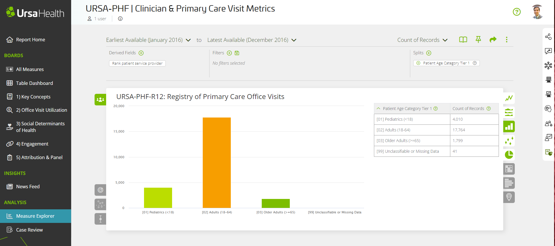
Finally, an example to make these best practices more concrete! This example will deal with URSA-PHF-R12: Registry of Primary Care Office Visits, in the Population Health Foundations module.

This chart is all well and good, but, how do we define office visits? How do we define primary care office visits? Would a telehealth visit be included in this measure? The first place to look would be the measure's terms, wherein we see that the definition of Clinician Office Visit is “An encounter in which the patient received in-person care from a clinical provider…” So: no telehealth visits.

Now, that’s just Clinician Office Visits. You’ll see further down the terms list that Primary Care Clinician Office Visits are a subset of those; that’s what’s being reported on this measure.
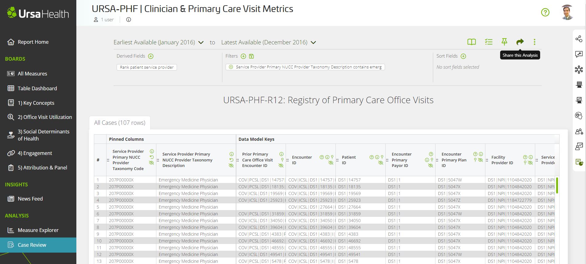
However, reviewing the case-level detail in Case Review you might notice, as in the following screenshot, that there are visits with providers whose NUCC codes identify them as “Emergency Medicine Physician”.

Is this a mistake? Why would these visits be included in the measure? Answering this question surpasses the “Level 1” tools that are available to you in Analytics Portal. With the filter in place, and the two key columns pinned, this would be a great time to “Share this Analysis” with your CSM to pose that question.
But let’s say you wanted to go straight to “Level 3” and trace back the logic to understand why this decision had been made. Clicking into “This Measure” from the Zone Nav, and then on the pencil icon, brings you into the full view of this measure. You’ll notice on the leftbar that it’s built on two objects, “Data Mart for Primary Care Office Visits”, which is the main upstream object, and “Data Mart for URSA-CORE Patient Timelines”, which provides some additional patient detail.

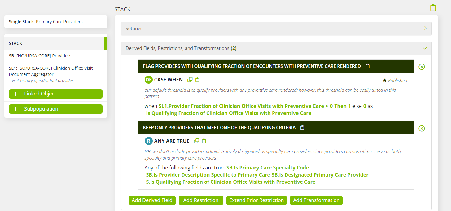
So we continue our tracing odyssey by drilling into “Data Mart for Primary Care Office Visits”, and from there into “Primary Care Clinician Office Visits”, and from there into “Primary Care Providers”, and this is where we find the logic that explains how a visit with an emergency medicine physician might end up in a primary care office visit measure.

In short, if a physician has a history of providing the sorts of service associated with primary care – particularly: preventative care – then they will make our list of primary care providers, no matter what their NUCC code says. Note also per the comments that the decision of how much preventative care a provider has to render in order to make our Primary Care Physician list is the sort of logic that can be easily tuned within this object, so as to conform with whatever local definition your team intuits as being most appropriate.