Measure Explorer is Ursa Studio’s versatile tool for filtering, splitting, and comparing visualized measure results. Users can choose from a variety of chart types via the icon tabs on the right-hand side of the chart panel, as well as apply statistical controls appropriate to a given chart from a selection of options at the chart’s left.
Chart Type: Results Over Time
Displays the measure’s results per reporting period. If users select to split a results-over-time chart, then they will see multiple line charts, one line for each split. If the split field is a numerator field, or if the chart is measuring case volume, then the chart will be stacked.
Users can also isolate a particular range of the chart by dragging the mouse. The selected value, as well as some drilldown options, will become available via a box at the bottom of the screen.
Chart Type: Sparkline
Sparkline charts allow users to see multiple results-over-time charts in one panel. They are only available for analyses with a split. Works with the full array of measure perspectives. When more than one measure perspective is active, then two charts will be shown per split.
Chart Type: Bar Chart and Dot Chart
A bar chart aggregates all available data, and users can compare the relative performance of different populations by slicing on an analytic field. As splits are applied, the chart disaggregates into one bar per split result. The data is also shown in a table beside the chart, which can be exported to CSV. The table and by extension the chart can be sorted by clicking on the table’s column headers. Users can also choose for the data to be rendered as a dot chart. Dot charts have all the same functionality as bar charts.
Chart Type: Pie Chart
Pie charts can be used in any circumstance in which the results can be considered to add up to a meaningful whole. In practice, pie charts can be used in two distinct contexts:
- First, they can be used in case count mode, typically with splits.
- Second, they can be used to show the measure value of unsplit binary measures. In this second case, there will be only two pie slices, representing the “yes” and “no” values of the measure.
Chart Type: Matrix View
When two splits have been applied to a measure, users can render the measure results as a heat-map showing a matrix of values at the intersection of the two splits. When a measure’s results have been rendered in matrix view, any of available measure perspectives can be applied. The Show Data Table toggle will transform the visualization from a heat map to a data table. The matrix view data table can support three or more splits, by putting the first split along the top x-axis, and all the subsequent splits as collapsible nested rows, akin to a pivot table.
Chart Type: Case Distribution
A case distribution chart goes beyond the capabilities of the bar chart, which just shows the average measure result for each split. Instead, the case distribution chart shows the relative frequency of the values that comprise the average result. For real-valued measures with many distinct values, results are grouped into discrete buckets for legibility. Users can isolate a range of case values by dragging the mouse over the case distribution chart. This is typically done to quickly screen out outliers.
Chart Type: Maps and Choropleths
See the Map document for the full details of these chart types.
Perspective Controls
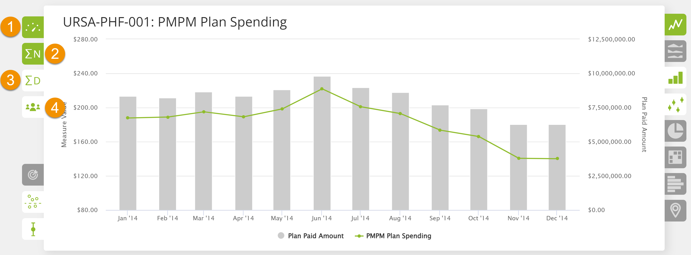
Measure Explorer enables users to easily toggle between different perspectives of a measure’s result. Users typically can choose any two perspectives at the same time. As seen in the figure below, when more than one perspective is engaged, the left axis will represent one perspective’s range, and the right axis will represent the other. The following are the four potential perspectives that users can select:
- Measure Value: This is the default perspective and displays the results of dividing the measure’s numerator by its denominator. In the figure below, the measure result, which is plotted as the line graph, shows the health plan’s total spending divided by the total number of member-months for each reporting period.
- Sum of Numerator: This perspective displays the sum of the measure’s numerator. In the figure below, this value is plotted as the bar chart and shows the health plan’s total spending for each reporting period. If the measure value perspective is toggled off in this figure, the sum of numerator perspective would be replotted as a line graph.
- Sum of Denominator: This perspective displays the sum of the measure’s denominator. Although not shown in the figure below, this value would display the total number of member-months per reporting period as a line or bar chart, depending on the other perspective engaged.
- Distinct Case Count: This perspective displays the number of unique cases associated with the measure. Although not shown in the figure below, this value would display the total patients per reporting period as a line or bar chart, depending on whether another perspective is engaged. When the sum of denominator perspective is identical to this perspective, then only one tab will appear. This is the typical behavior for event- and entity-denominated measures such as a 30-day readmission rate or the percentage of members with diabetes, respectively.
- Benchmark Value: Users can identify one or more benchmark fields in the Measure Metadata panel of measure workshop, from among the published fields of a measure. If any benchmark fields are identified, these will unlock two new perspectives in measure explorer: benchmark value and benchmark ratio. If there are multiple benchmarks defined for a measure, users can cycle through each benchmark field by re-clicking on these perspective tabs. Because the benchmark values may vary across rows within the selected splits, the min and max benchmark value will be calculated, along with the average, for all the splits under review. Unless these values are all identical, the min and the max will be shown as an error bar in the measure explorer chart.
- Benchmark Ratio: The benchmark ratio represents the measure value divided by the benchmark value.
Certain chart types restrict perspectives. For example, the case distribution chart always shows “Measure Value” and “Distinct Case Count,” and the matrix view can show only one value at a time.
Users can customize the labels for the sum of numerator and sum of denominator perspectives on a per-measure basis by updating the Denominator Label and Numerator Label fields in a measure’s naming panel in Measure Workshop.
Other Controls
Users can also add or remove control limits and trend lines via the icon tabs on the left side of the chart panel. These controls are not available on all chart types. For bar and dot charts, the trend line toggle controls the "Average" line. Any or all controls can be toggled on or off at the same time.
- Data Table: For the Results Over Time, Pie Chart, Bar Chart, and Dot Chart types, users can toggle a panel to see the data in tabular form alongside the chart. For Matrix View, Pie Chart, Bar Chart, and Dot Chart types, the data table can be toggled to take up the entire screen. If the data table is in full-screen mode and there are more than one split, the data table will act like a pivot table, with collapsible subtotal rows. Users can hide columns of the measure explorer data table; this configuration will be honored when pinned to a board.
- Measure Target: Developers can set a measure-specific performance target when authoring the measure.
- Measure Trend / Mean: When the measure is displayed as a results-over-time chart, the measure's trendline is displayed. However, when the measure's visualization is rendered as a box or dot chart, the measure's mean is displayed using the same control.
- Measure Control Limits / Confidence Intervals: When the measure is displayed as a results-over-time chart, 3-sigma confidence interval are displayed. When the measure's visualization is rendered as a box or dot chart, confidence intervals are displayed.
Filters
Measure Explorer provides complete control over filtering data. Any field can be filtered using a variety of operators, depending on the data type of the field. Users can see, edit, and remove the filters that are in place.
A measure’s results can be filtered in one of three ways:
- By applying date filters using the date control dropdowns. Date filters can also be applied by interacting with results over time charts
- By filtering on one or more fields associated with the measure in the Filter control side panel. Field-level filters can also be applied by interacting with charts that have been split
- By applying quick filters or filters that are preconfigured and can be executed with a single click.
In some circumstances, filters are dictated by requirements outside of the filter control. If the filter is mandatory, such as in the case of an entity-denominated measure, there is no way to remove it.
Measure Expressions
Users can chart any numeric field instead of the numerator via the measure expression dropdown above the filter control.
As with charting the numerator, all the perspective options are still available. The "value" perspective shows the aggregated value of the selected measure expression divided by the denominator. The "sum" perspective shows the aggregated value alone. The sum-of-denominator and distinct-case perspectives work independently of the selected measure expression.
Users can customize the metadata of each expression via a management console that can be accessed via the "Manage Measure Expressions..." menu item at the bottom of the measure expression dropdown.
When charting a numerator field in a long-form measure, users will be prompted to choose the row aggregation function by which values will be aggregated to the observation level, before being summed across observations. This selection will be saved in the same management console, and all the selections in the management console will be persisted across all users and report reruns.
Comparing Measures
Measure Tracker allows users to compare the results of measures against each other as long as the comparison measures are compatible with the splits and filters currently in place. As users add splits and filters, the list of available comparison measures shrinks. Likewise, as users add comparison measures, the list of legal splits and filters shrinks. Users can choose among different options for aligning the comparison measures using items in the hamburger menu.
When adding a comparison measure to an analysis, users can select a measure expression to render among the numeric fields of the comparison measure, as they can with the primary measure of the analysis.
When comparison measures are added in either bar chart or dot chart mode with the full-screen data table, the comparison measure results will be rendered as columns in a matrix-view-style data table, instead of in subsequent panels.